Florist website design that turns browsers into orders — a UK flower shop guide to layout, photography, colour and the design choices that win local trade.
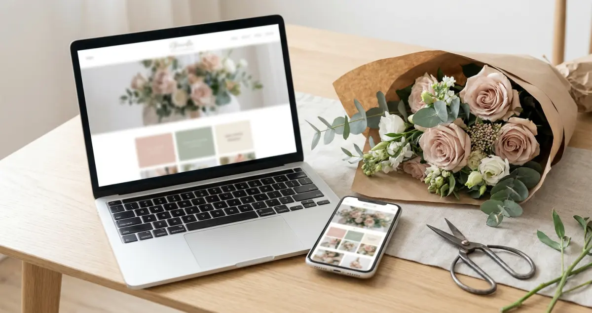
Florist website design is how your site looks, feels and guides a customer — the layout, photography, colour and flow that turn a browser into an order. Good design isn't about being the prettiest flower shop online; it's about making a local customer feel something, then making the order effortless.
You're conditioning stems before a wedding install and your website looks like it was built in 2014. Sound familiar? The reality for most florists is that the flowers are stunning and the website doesn't do them justice — and customers judge the bouquet by the website before they ever see your work. 8 min read.
What You'll Learn
- The design principles that make a florist website feel premium
- How photography makes or breaks your flower shop website
- Layout and colour choices that guide customers to order
- Mobile-first design — where most flower searches actually happen
- The florist website design mistakes that cheapen beautiful flowers
Related: Florist Website: A UK Owner's Guide
Start With Photography, Not Fonts
First, the truth every florist needs to hear: your photography is your design. You can have the slickest template on earth, but if the flower photos are dark, cluttered or stock, the site looks cheap. Get this right and half the design job is done.
Shoot your own arrangements in natural light against a clean background. A windowsill and a phone beat a studio you can't afford. For example, a flower studio in York reshot its whole gallery on an iPhone by the shop window and looked twice as expensive overnight — same flowers, better light.
Rule of thumb only: 8–12 strong, recent photos of your own work beat 50 mediocre ones — quality and freshness signal a real, working florist.
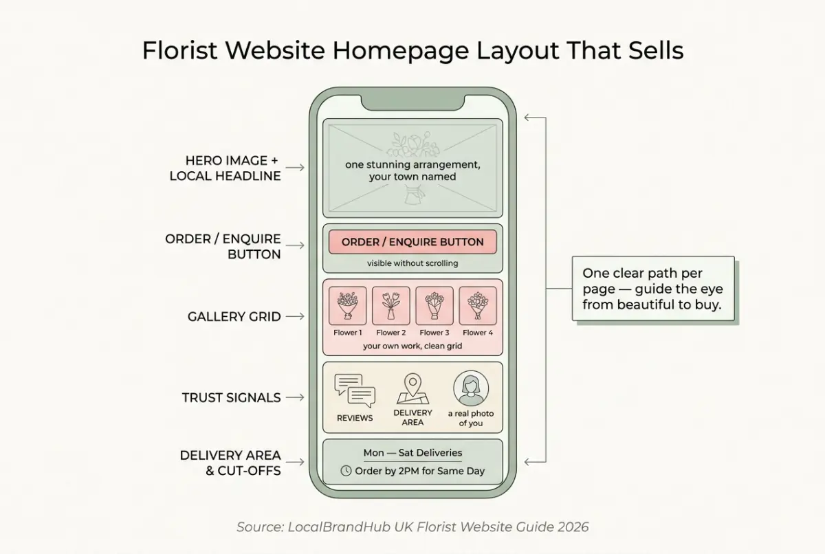
Layout That Guides the Eye
Next, structure the page so a busy customer never has to think. Good florist website design leads the eye from "beautiful" to "buy" in seconds.
- Hero image first — one stunning arrangement and your local headline.
- Order or enquiry button visible without scrolling.
- A clean gallery in a simple grid, not a cluttered collage.
- Trust signals — reviews, delivery area, a real photo of you or the shop.
- One clear path per page, not five competing links.
For example, a florist in Cardiff moved the order button from the footer to the top of every page and saw enquiries climb — same site, same flowers, one fewer barrier. Aim for the order or enquiry button to be reachable in 1 tap from any page.
If you can't tell whether your layout works, open the site on your phone and count the taps to place an order. That's usually a sign of the problem — if it takes more than two or three, you're losing customers at every extra step.
Colour & Brand: Look Like Yourself
Now that the bones are right, colour brings the personality. The mistake is chasing trends; the win is matching your actual shop and flowers.
Pick one warm, neutral base (soft white, sage, blush or warm grey) and one accent that matches your branding and your blooms. Stick to 2–3 colours total — more than that and the site starts competing with the flowers instead of framing them. For example, a contemporary florist working in muted, dried-flower palettes should not bolt on bright primary buttons — the website should feel like walking into the shop. A wedding florist might lean ivory and eucalyptus; a bright high-street shop might use a warm coral accent. Consistent colour across your site, Instagram and shopfront makes a small florist look established and instantly recognisable.
Why this matters: design consistency is free credibility. When your website, your wrapping and your window all feel like the same brand, customers trust you with a £150 wedding order.
Related: Best Website Builder for Florists
If you're reading this thinking your site looks dated and you've no idea where to start, you're not alone — most florists feel the same, and a few small visual fixes go further than a full rebuild.
Design for Mobile First
However, here's where most florist websites quietly fail: the phone. Most "florist near me" searches happen on mobile, often outdoors, in a hurry — so your site has to look and work beautifully on a small screen first.
Big tap targets, fast-loading images, a phone number that dials with one tap, and a gallery that scrolls smoothly. Aim for the page to load in under 3 seconds — every extra second loses impatient mobile buyers. For example, a florist who compressed their 12 huge gallery photos cut their load time in half and stopped losing customers who bounced before the flowers even appeared. If you're only designing for the big screen on your laptop you'll always lose the customer standing on the pavement deciding where to order.
Related: How to Set Up a Florist Online Shop
Florist Website Design Mistakes to Avoid
Knowing what to skip protects both your brand and your orders. The biggest mistake is letting the design get between gorgeous flowers and an easy order.
- Stock flower photos. Customers want your work — stock screams "not a real florist."
- Dark, cluttered galleries. Beautiful flowers deserve light and space.
- Slideshows and auto-play. They slow the site and annoy mobile users.
- A hidden order button. If the next step isn't obvious, there is no next step.
Great florist website design isn't about impressing other designers. It's about letting a local customer fall for your flowers and order them in under a minute.
Frequently Asked Questions
What makes a good florist website design?
Strong, real photography of your own arrangements, a clean layout with the order button visible immediately, one warm colour palette that matches your shop, trust signals like reviews and delivery area, and flawless mobile performance. Design should showcase the flowers and remove every barrier to ordering.
What colours work best for a florist website?
One warm, neutral base (soft white, sage, blush or warm grey) with a single accent that matches your branding and your flowers. Keep it consistent with your shopfront and Instagram so a small florist looks established and trustworthy.
Should I use stock photos on my florist website?
No — stock photos undermine trust because customers want to see the flowers you actually make. Even phone photos shot in natural light beat stock, and they prove you're a real, working florist rather than a reseller.
How important is mobile design for florists?
Critical — most "florist near me" searches happen on phones, often outdoors and in a hurry. Design mobile-first: big tap targets, fast images, a one-tap phone number, and an obvious order button.
Your Next Step
Florist website design is never finished — you refine it as your style and stock evolve. Small visual fixes compound into a site that sells.
Weekly Action
Work this florist website design checklist once a week:
- Replace one weak photo with a fresh shot of recent work
- Open your site on your phone and count taps to order
- Check your colours match your shop and Instagram
- Make sure the order button is visible without scrolling
- Remove one element that clutters the page
If you only have 30 minutes a week, do this: photograph one of this week's best arrangements in natural light and swap it onto your homepage. That's enough — a steadily refreshed gallery beats a redesign you never start.
Ask yourself: would your website make a stranger trust you with a wedding? If not, the design is where the work starts. Turning a beautiful site into steady local orders is the weekly, done-for-you marketing LocalBrandHub handles for independent florists.
For restaurants, salons, and local businesses
Need help with your marketing?
We help UK businesses turn social media into real results, not busywork.
Get in TouchKey Takeaway
Key Takeaways: Florist Website Design
Design exists to sell your flowers, not to win awards — make it beautiful, then make it effortless.
- Photography is your design — shoot your own work in natural light.
- Layout guides the eye from "beautiful" to "buy" in seconds.
- One consistent palette that matches your shop builds trust.
- Design mobile-first — that's where customers actually find you.
- Never let design hide the order button.
About the Author
Local Brand Hub
Empowering UK Businesses
Local Brand Hub provides comprehensive business management tools designed specifically for UK local businesses to streamline operations, automate marketing, and grow revenue.
More articlesRelated Articles
 Business Growth
Coffee Shop Seating Ideas: A UK Cafe Owner's Guide
Coffee shop seating ideas that add covers and keep customers longer — a UK owner's guide to seating types, layout, comfort and outdoor space.
 Business Growth
Coffee Shop Lighting Ideas: A UK Cafe Owner's Guide
Coffee shop lighting ideas that make a cafe feel warm and photograph beautifully — a UK owner's guide to layers, colour temperature and budget fixtures.
 Business Growth
Coffee Shop Interior Design: A UK Cafe Owner's Guide
Coffee shop interior design that fills quiet afternoons — a UK cafe owner's guide to layout, seating, lighting, ambience and budget ideas.