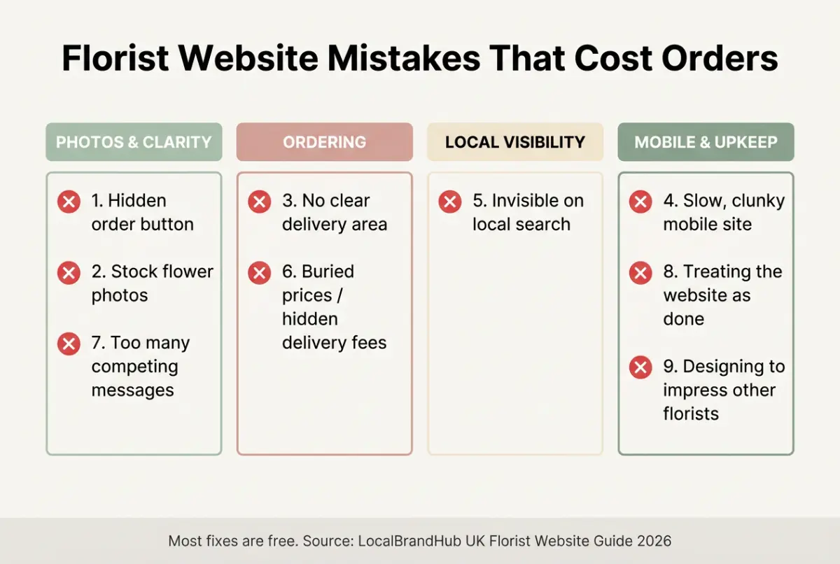
The florist website mistakes that quietly lose UK flower shops orders to the chains — nine common errors, why they happen, and the simple fix for each one.
Florist website mistakes are the small, fixable errors that send a ready-to-buy customer to a competitor — a hidden order button, stock photos, a missing delivery area, a slow page on mobile. The flowers are rarely the problem; the website is. Fix these nine and you'll catch orders you're losing without ever knowing.
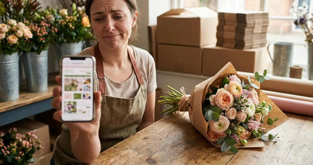
You're conditioning stems before a wedding install, your work is genuinely beautiful, and yet the online orders trickle in. Sound familiar? The reality for most florists is that the website is quietly undoing the talent — and the fixes are usually free. 8 min read.
What You'll Learn
- The nine florist website mistakes that cost real orders
- Why each one happens — and the simple fix
- How to spot them on your own site in minutes
- The one mistake that loses you local "florist near me" trade
- How to turn a leaky website into a steady order-taker
Related: Florist Website: A UK Owner's Guide
Mistake 1: Hiding the Order Button
First, the costliest mistake of all. If a customer can't see how to order or enquire within a second or two, most won't hunt for it — they'll leave.
The fix is simple: put one clear order or enquiry button at the top of every page, above the fold. For example, a florist in Cardiff moved their button from the footer to the header and watched enquiries climb — same site, one fewer barrier.
Rule of thumb only: the next step should be obvious on every page within 1 tap — if a customer has to scroll or search, you've already lost some of them.
Mistake 2: Using Stock Flower Photos
Next, the trust-killer. Stock photos tell a customer you might not actually make what they're seeing — and florists live and die on showing real work.
Swap every stock image for your own arrangements, shot in natural light. A windowsill and a phone beat any stock library. For example, a florist who replaced 14 stock photos with their own phone shots looked twice as expensive overnight — same flowers, real proof. Customers buy the flowers you make, not a catalogue.
Related: Florist Website Design: A UK Guide
Mistake 3: No Clear Delivery Area
Now, the silent order-killer. Nothing stops a sale faster than "do they even deliver to me?" If your delivery area isn't obvious, customers assume the answer is no.
Add a simple postcode list or a short "we deliver to..." line near your order button, with your fee and same-day cut-off. For example, one florist added a 3-mile delivery map and an "order by 1pm for same-day" line and cut their "do you deliver to me?" calls almost to zero. Clarity here removes the single biggest hesitation a local buyer has.
Mistake 4: A Slow, Clunky Mobile Site
However, here's where most florist websites quietly fail: the phone. Most "florist near me" searches happen on mobile, often outdoors and in a hurry — and a slow site loses them before the flowers even load.
If you're reading this thinking your site is probably fine, you're not alone — most florists are genuinely surprised when they first test it on their own phone on mobile data. If you can't tell whether yours is fast enough, open it and count the seconds. That's usually a sign of the problem — anything over 3 seconds and impatient buyers bounce. For example, a florist who compressed their oversized gallery photos halved their load time and stopped losing mobile customers before the flowers appeared. Compress your images and keep the design simple.
Why this matters: a customer standing on the pavement deciding where to order won't wait for a slow site. Mobile speed isn't a nice-to-have — it's where the order is won or lost.
Mistake 5: Invisible on Local Search
If you're only relying on Instagram or word of mouth you'll always lose the customer Googling "florist near me" right now. Being absent from local search hands that trade straight to the chains.
The fix is free: claim and fill your Google Business Profile, put your town in your page titles and headings, and gather reviews. This is how you take local trade back from Bloom & Wild and Interflora — not by outspending them, but by owning your postcode. Our florist marketing guide covers local search in full.
Mistake 6: Burying the Price (or Hiding Delivery Fees)
Next, the checkout-killer. Customers distrust prices they can't find, and they abandon orders when a surprise delivery fee appears at the final screen.
Show prices clearly and put the delivery cost upfront. For example, a flower shop that revealed an £8 delivery fee only at checkout had customers dropping out there; showing it from the first click fixed it overnight.
Related: How to Set Up a Florist Online Shop
Mistake 7: Too Many Competing Messages
Now, the clarity problem. A homepage shouting about weddings, funerals, subscriptions, classes and gifts all at once gives a customer no clear next step — so they take none.
Pick one primary action per page. Lead with how you mostly make money — same-day ordering for a high-street shop, an enquiry form for a wedding studio — and let everything else support it. For example, a florist who cut their homepage from 5 competing calls-to-action down to 1 clear "order now" button saw more people actually take the next step.
Mistake 8: Treating the Website as "Done"
Moreover, a website left untouched for two years slowly dies. Seasons change, your best work changes, and a stale site stops reflecting the florist you are now.
Tend it weekly. Swap in fresh photos, update seasonal cut-offs, add a new review. For example, a florist who spent just 10 minutes a week refreshing their gallery and reviews quietly climbed their local rankings over a season — no redesign, just upkeep. A site that gets five minutes a week beats one that gets a full redesign every three years.
Mistake 9: Designing to Impress Other Florists
Knowing what to skip matters as much as what to add. The biggest mindset mistake is designing to impress your peers instead of serving a busy local customer.
Great florist website design isn't about impressing other florists. It's about letting a stranger fall for your flowers and order them in under a minute. The question isn't whether your website looks clever. It's whether it sells.
Frequently Asked Questions
What is the most common florist website mistake?
Hiding the order or enquiry button. If a ready-to-buy customer can't see how to order within a second or two, most leave rather than hunt for it. Put one clear button at the top of every page.
Why is my florist website not getting orders?
Usually one of these: the order button is hard to find, the photos are stock not your own, there's no clear delivery area, the site is slow on mobile, or you're invisible on local search. Fix those and orders typically follow.
How do I make my florist website faster?
Compress your images (they're usually the culprit), keep the design simple, and test it on your own phone on mobile data. Aim for under 3 seconds to load — most flower customers are browsing on a phone in a hurry.
How do florists compete with Bloom & Wild online?
Not nationally — locally. Claim your Google Business Profile, put your town in your page titles, gather reviews, and offer same-day local delivery the chains can't. You win the "florist near me" customer on your own street.
Your Next Step
Most florist website mistakes are free to fix — you just have to spot them. A weekly look keeps the leaks closed.
Weekly Action
Work this florist website mistakes checklist once a week:
- Check the order button is obvious on every page (mobile included)
- Swap one stock or weak photo for your own recent work
- Confirm your delivery area and fee are clearly shown
- Test your load speed on your phone on mobile data
- Google "florist near me" and note where you rank
If you only have 30 minutes a week, do this: open your own website on your phone, try to place an order as a customer would, and fix the first thing that trips you up. That's enough — one fixed mistake a week quietly turns a leaky site into a steady order-taker.
Ask yourself: would you order from your own website if you'd never met you? If not, the mistakes above are where the work starts. Plugging those leaks and turning the site into steady local orders is the weekly, done-for-you marketing LocalBrandHub handles for independent florists.
For restaurants, salons, and local businesses
Need help with your marketing?
We help UK businesses turn social media into real results, not busywork.
Get in TouchKey Takeaway
Key Takeaways: Florist Website Mistakes
Your flowers are rarely the problem — the website usually is, and the fixes are mostly free.
- Make the order button impossible to miss on every page.
- Use your own photos and show a clear delivery area.
- Fix mobile speed — that's where most customers find you.
- Be visible on local search to take trade back from the chains.
- Tend the site weekly — small fixes beat a rare redesign.
About the Author
Local Brand Hub
Empowering UK Businesses
Local Brand Hub provides comprehensive business management tools designed specifically for UK local businesses to streamline operations, automate marketing, and grow revenue.
More articlesRelated Articles
 Business Growth
Coffee Shop Seating Ideas: A UK Cafe Owner's Guide
Coffee shop seating ideas that add covers and keep customers longer — a UK owner's guide to seating types, layout, comfort and outdoor space.
 Business Growth
Coffee Shop Lighting Ideas: A UK Cafe Owner's Guide
Coffee shop lighting ideas that make a cafe feel warm and photograph beautifully — a UK owner's guide to layers, colour temperature and budget fixtures.
 Business Growth
Coffee Shop Interior Design: A UK Cafe Owner's Guide
Coffee shop interior design that fills quiet afternoons — a UK cafe owner's guide to layout, seating, lighting, ambience and budget ideas.