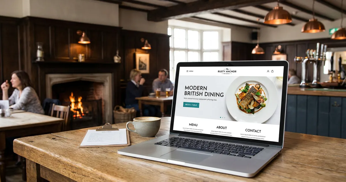
Restaurant website examples judged the way a hungry stranger judges them: on a phone, against a timer. Patterns worth copying, and those to leave alone.
Would a stranger book from your website in twenty seconds? That is the test the restaurant website examples worth copying pass, and the award winners often fail: open one on a phone and see whether they can find your hours, read the menu with prices and start a booking.
If you're a restaurant owner with twenty seconds to spare, picture handing your phone to somebody who has never seen your site.
Search this term and you land in a gallery instead. Full-bleed photography, a scroll that parallaxes, a typeface somebody agonised over. All beautiful. But which of them survives a hungry stranger at half six on a wet Tuesday?
Nobody has ever admired a restaurant website. They have only ever used one, or left one. Never copy a layout because it won a prize, or you'll inherit somebody else's problem along with the look.
If you are reading this after a twelve hour shift and thinking the website can wait, it probably can. The test below cannot.
Related: Restaurant Website Design
What you'll learn
- How to judge any restaurant website example on a phone, in twenty seconds
- Four patterns worth copying, and five worth leaving in the gallery
- What your Google profile already carries, so your site stops duplicating it
- Where allergen information has to appear if you take orders online
Why the best-looking restaurant website examples mislead you
A design gallery judges a still frame. It rewards composition, restraint, a considered grid. It cannot see a thumb, a patchy signal on the walk from the station, or a group chat waiting for somebody to just pick somewhere. A site can win the first competition and lose the second.
They were built for a different problem. Those restaurants were rarely struggling to be found, only to be desired. If people already walk past your window and wonder, copy away. If they are choosing between you and two others in the rain, you need a site that settles it.
The screen that settles it is small. Ofcom found that in May 2024, 75% of the time UK adults spent online per day across smartphones, tablets and computers was spent on a smartphone. That is time across the whole population, not visits to your site, so read it as a habit rather than a forecast.
Google arrived at the same screen from the other side: its documentation says it uses the mobile version of a site's content, crawled with the smartphone agent, for indexing and ranking. Diner and crawler are both on the phone version.
The twenty second test any restaurant website has to pass
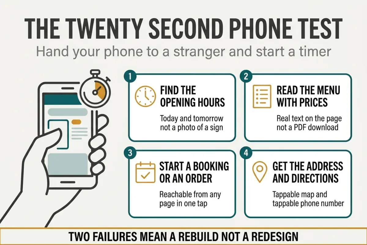
The four things a stranger has to complete before they lose interest. Two failures point at the structure, not the styling.
Find someone who has never seen your site: a supplier, your partner, whoever does your accounts. Hand them your phone with the site open, start a timer and stay quiet. Staying quiet is the hard part, and it tends to be the part that produces an answer.
- The opening hours, today and tomorrow, as text. Not a photograph of the sign on your door.
- The menu with prices, as real words on the page. Somebody choosing between you and the place opposite is doing sums.
- A booking or an order, started. Not completed, started. If the button takes a hunt, you have found your rebuild.
- The address and phone number, both tappable. A number you have to select and copy is a call you do not get.
Picture a thirty cover bistro that photographs beautifully. Hours take four seconds. The menu takes eleven, because it is a PDF that opens in another app. At twenty seconds the tester still has not found the booking button, which lives in the footer. The owner had been saving for new photography, and the photography was the only part already working. Those timings are invented to show the shape of a result, not measured.
One failure is a fix. Two is structural, and no photographer solves a structural problem.
What your Google profile already carries, and what your site is left holding
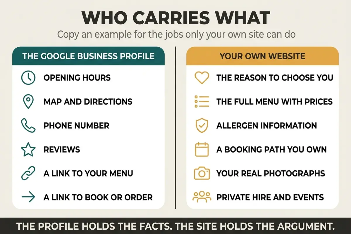
The profile holds the facts. The site holds the argument for choosing you.
Google Business Profile Help states that a profile can carry links helping customers check a menu, make a reservation or place a food order directly from Maps or Search.
Say you run a twelve table place with a tidy profile: a stranger can do all three without ever loading your homepage. Copying an example for its booking button copies the one job Google already does for you.
| The job | Who carries it |
|---|---|
| Menu and booking links | Your Google profile |
| The reason to choose you | Your own words |
| Full menu with prices | Your site |
| Allergen detail before an order | Your site |
| A booking path you own | Nobody else |
| Private hire, Christmas, vouchers | Your site, or nowhere |
Treat that split as a rule of thumb for what to copy. Your photographs belong on the right hand side too: our restaurant food photography guide covers getting usable shots on a phone. Check your own standing first if you are unsure: LocalBrandHub gives you a visibility score, one number for how easily nearby customers find you. See what it covers.
Why this matters: an hour spent rebuilding what the profile already carries is an hour not spent on the half of the list nothing else will do for you.
Four patterns worth stealing from restaurant websites that pass
The menu is text, not a download. A PDF is a separate document a phone fetches, opens elsewhere and renders at the size of a stamp. Put the menu in the page and keep the PDF for the printer. Our restaurant menu page design guide covers layout and dietary marks.
Hours are current, exceptions included. Bank holidays, the week you close in January, the kitchen that stops at nine on Sundays. A stranger who cannot tell whether you are open has been handed a reason to go elsewhere.
The booking route follows the reader. The way in should be one tap from wherever they got interested. People decide at different moments, and your homepage is only one of them.
The photographs are yours. Stock food says nothing a reader can check. For instance, one honest shot of your own corner table on a wet Wednesday answers the question they are actually asking.
If you fix only one of the four, fix the menu. It is where a linked profile sends people. For the mobile specifics, see our mobile restaurant website guide.
The allergen line most restaurant website examples skip
If your site takes orders, one thing on it is not a design choice. Food Standards Agency guidance treats ordering a takeaway as distance selling and says allergen information must be made available at two stages: before the purchase of the food is completed, in writing on a website or menu or by phone, and again when the food is delivered.
Read what that actually obliges. It is a duty about information reaching a customer at two moments, not a specification for your web build. No law names a plugin, a template or an ordering system.
For instance, if the allergen detail sits on the same page as the order form, the first of those moments is covered by the page the customer is already reading.
What to stop copying
Do not build a splash screen. An animated logo before the content is a toll booth you built yourself. Every second it plays comes out of your twenty, spent before anybody has learned anything.
Autoplaying video with sound. Somebody is reading your site in a quiet office at four in the afternoon. You have just told their colleagues.
Do not file the booking link under "Contact". Contact is where people go to complain.
Avoid a photo gallery without prices because it loses checkpoint two every time. It is common among genuinely handsome restaurant websites.
Do not copy a hero video from a site with a marketing budget. It looks superb on the demo laptop. On a diner's 4G it is a loading bar where your menu should be.
Frequently asked questions
What makes a good restaurant website?
Current hours as text, the full menu with prices on the page, a booking route reachable from anywhere, a tappable address and phone number, and photographs of your own room. If you take orders online, allergen information before checkout joins that list as a duty rather than a choice. Everything after that is preference.
Do I still need a website if I have a Google Business Profile?
Yes, for narrower reasons than you think. Google says a Business Profile can carry links helping customers check a menu, make a reservation or place a food order from Maps or Search.
The profile holds the facts. Your site holds the full menu, the allergen detail and the argument for choosing you. Our restaurant Google Business Profile guide covers setting it up.
Should my restaurant menu be a PDF?
No. A PDF is a separate document a phone downloads and then asks you to pinch, and the dishes inside it are not text on your menu page. Put the menu in the page as words and prices.
How much should a restaurant website cost?
It depends on how much you do yourself and whether the site has a job beyond bookings, such as private hire enquiries. Our restaurant website cost guide breaks down what the money buys.
Do I have to put allergen information on my website?
The duty is about what reaches the customer, not your web pages. FSA guidance treats a takeaway order as distance selling and says allergen information must be available before the purchase completes and again at delivery. If you sell online, the site is the obvious place to meet the first stage.
Score your setup
Key Takeaway
A starting experiment, not a rule. Spend five minutes a week on this, then adjust the rhythm to whatever your own results justify. If you only have five minutes this week, do step one and stop. That is enough to start.
- Tuesday: start by handing your phone to whoever is on the pass, site open, timer running. Stay quiet.
- Wednesday: fix whichever checkpoint failed first. Only that one.
- Thursday: run the test again on somebody else.
Whatever fails first is your week's work, and it is rarely what you were planning to spend money on. Can you honestly say you would book from your own website if you found it on Google at half six?
Guide reviewed and last updated 13/08/2026. Sourced figures come from the named public sources below; the worked example is illustrative, not measured.
For restaurants, salons, and local businesses
Need help with your marketing?
We help UK businesses turn social media into real results, not busywork.
Start freeSources
Get More Marketing Tips
Practical marketing tips for UK business owners, straight to your inbox. No spam, unsubscribe anytime.
About the Author
Local Brand Hub
Empowering UK Businesses
Local Brand Hub provides comprehensive business management tools designed specifically for UK local businesses to streamline operations, automate marketing, and grow revenue.
More articlesRelated Articles
 Marketing Tips
Restaurant Homepage Design: 7 Elements That Convert
Learn 7 essential restaurant homepage design elements that convert visitors into diners. Mobile-first layouts and booking buttons.
 Marketing Tips
Mobile Restaurant Website: Essential UK Design Guide 2025
Create mobile restaurant websites that convert visitors to diners. Essential features, templates, builders, and UK costs.
 Marketing Tips
Restaurant Landing Pages: Convert Visitors to Bookings
Build restaurant landing pages that turn visitors into bookings. Covers mobile layout, page speed, CTAs, and social proof with UK examples.