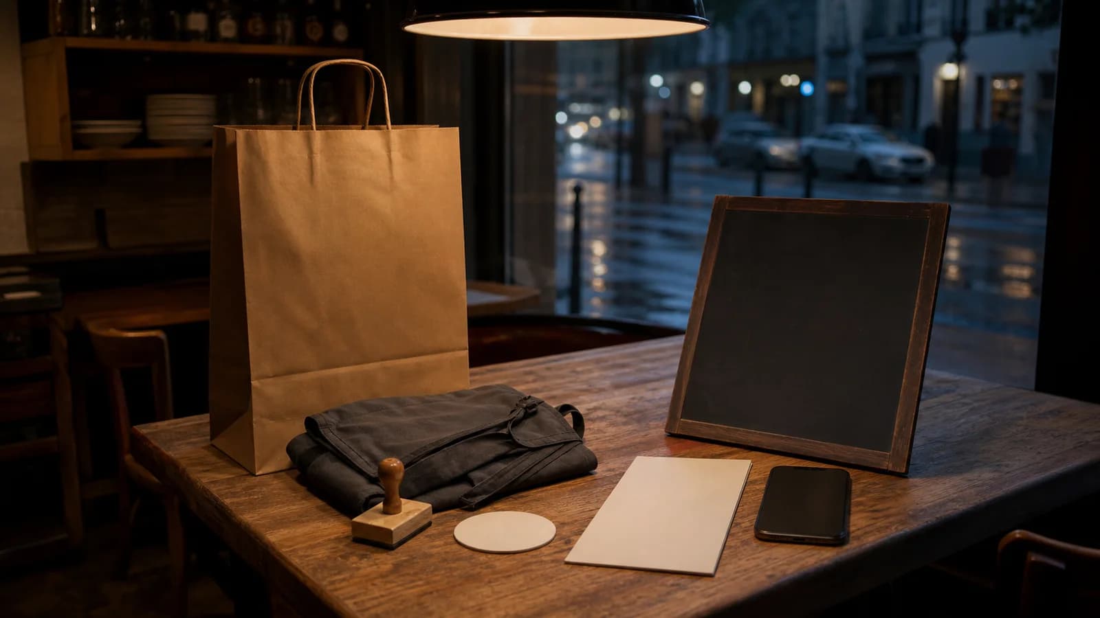
How to design a logo for restaurant signs, menus and delivery apps that still reads at thumbnail size. UK guide to logo types, files, contrast and costs.
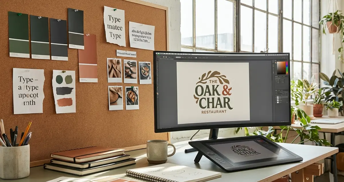
Start from where the mark will be smallest and roughest, not from a mood board. A restaurant logo has to be recognised on a fascia at dusk, as a thumbnail in a delivery app, printed in one colour on a bag and stitched onto an apron. The rest is taste, and taste can wait.
Picture yourself three weeks from opening, 200 generator mockups narrowed to three, all superb on screen. Then the sign maker asks for a single colour vinyl version and two turn into a smudge with a fork in it.
A mood board flatters everything. A fascia at dusk flatters nothing. You are not choosing the mark that looks best today, but the one that survives being reproduced badly by people you will never meet.
What makes a good restaurant logo?
A good restaurant logo does four jobs. It reads from across the road, holds together in one colour, fits a square without cropping into nonsense, and does not promise food you do not serve. Style sits downstream of all four. The second is the one a mood board hides.
The fourth job is the easiest to underrate. A pictorial mark is a promise about the menu, and menus move. An elegant lobster says seafood, which is excellent until the chef leaves and the room goes Italian.
Design it backwards from the smallest screen and the biggest sign
Work through the reproductions worst first. If the mark holds at the bottom of that list, the flattering versions take care of themselves.
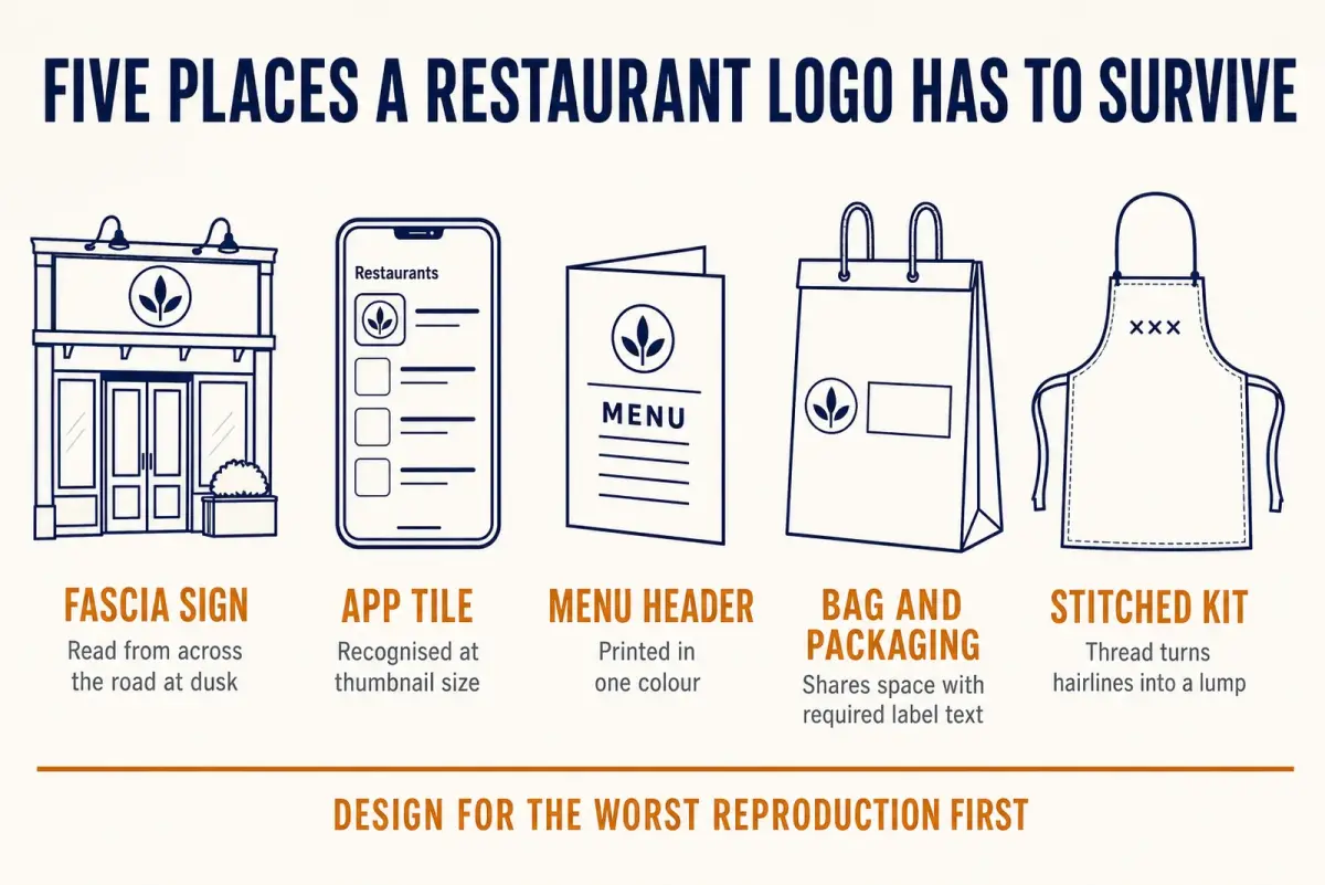
The fascia and the thumbnail pull in opposite directions. A mark that satisfies both is usually simpler than the one you first liked.
The fascia. Stand on the far pavement and read your neighbours' signs. The ones you can make out are short, high contrast and light on detail, because a sign is read at an angle, in the rain, by somebody walking. Illumination and materials belong to our restaurant signage guide, but the shape you pick now decides how much work they have to do.
The app tile. Your mark spends much of its life as a small square in a crowded list. Drop the artwork onto your phone, shrink it to tile size, hold it at arm's length and see if you still know what it is. Thin lines and script names fail this one quietly.
The menu and the apron. One colour, small type, stock that soaks up ink, and thread that turns hairlines into a lump. A mark built on a gradient is a grey blob here. Our menu design principles guide covers the layout around it.
Packaging. If you sell anything prepacked, a jar of sauce or a boxed sandwich, your mark shares a label with text that has a legal floor. GOV.UK food labelling guidance states that all the mandatory information on a food label must be printed using a font with a minimum x-height of 1.2 millimetres. That text cannot shrink to make room. Your logo can, so on a small label the logo gives way.
What are the 7 types of logos?
The seven usually listed are the wordmark, the lettermark, the pictorial mark, the abstract mark, the mascot, the combination mark and the emblem. They are not seven equally good options for a restaurant. They are seven bets about how much recognition you already have.
- Wordmark. The name itself, set as type.
- Lettermark. Initials only, which assume people already know them.
- Pictorial mark. A recognisable object, a fish, a cup, a loaf.
- Abstract mark. A shape that means whatever you teach people it means.
- Mascot. A character with a face.
- Combination mark. An icon and the name, usable together or apart.
- Emblem. The name locked inside a crest or badge.

Every type has a place it stops working. Choose the failure you can live with.
For a single site with no reputation yet, the wordmark and the combination mark do the most work, because both put your name in front of somebody who has never heard it. The emblem is the classic pub answer and the classic thumbnail casualty: crest, banner, established date and a bird, all filling in at tile size. Want one anyway? Commission the simplified version at the same time.
What are the 5 elements of a good logo?
The five usually named are simple, memorable, relevant, versatile and timeless. Four of those are judgements you cannot settle on a Tuesday afternoon. Versatility is the one you can genuinely test, which is why it deserves your attention before sign off.
- Simple enough to redraw from memory.
- Memorable after one look rather than five.
- Relevant to your room, not to your category.
- Versatile at every size and in one colour.
- Timeless enough to outlast the fit-out.
Borrow a number from people who prove legibility for a living. The Office for National Statistics service manual states that meeting WCAG 2.1 level AA needs a minimum contrast ratio of 4.5:1 for normal text and 3:1 for large text. That standard is written for digital interfaces, not brand marks, and nothing in it binds a logo. Borrow it anyway: run your wordmark against its background in a free contrast checker. If the cream on beige you fell for comes back near 2:1, you have learned what the mockup was hiding.
Timeless mostly means not stamped with the year you opened. One trend is a choice. Three at once is a date stamp.
Can ChatGPT design a logo?
It can generate one, and generating is the easy half. An AI tool will hand you a hundred plausible marks in an afternoon. What it cannot tell you is which one your street will remember, whether something close already trades two towns over, or whether the file is any use to a sign maker.
Generators also converge. Ask several for a bistro logo and the same fork, the same leaf and the same circle keep turning up, because they draw on the conventions everyone else draws on. Fast for seeing options, poor for arriving at something nobody else has.
Two cautions before you use one:
- Check the file you are handed. Many tools export a raster PNG, and a sign maker will want vector artwork.
- Keep the input thin. Your name, a few words of feel, the styles you have ruled out. A design tool has no use for supplier pricing, staff details or anything about your customers. Before you upload anything, check the tool's current account and data use settings.
What do you need before you sign it off?
A logo is not finished when it looks right. It is finished when you hold the files that let others reproduce it without asking you.
- Vector master artwork, plus PNG exports with transparent backgrounds.
- A one colour version and a reversed version, made deliberately rather than improvised by a printer at 5pm.
- A minimum size and clear space note, so nobody shrinks it to fit a business card.
- Written confirmation the artwork is yours to use, which matters most when a freelancer or a generator made it.
Ownership is a separate decision with its own price. GOV.UK guidance states that registering a trade mark costs at least £205, and that it will usually cost more depending on your circumstances, for example how many types of goods or services you want to protect your brand in. A restaurant that will only ever be one restaurant faces a different sum from one planning a jarred sauce in shops. Either way, look at what already trades in your category and area before the sign goes on order. The expensive version of that discovery happens after the vinyl is cut.
After that the work is repetition: same mark, same crop, same colours, everywhere anyone meets you. LocalBrandHub's social post generator builds a week of posts from templates in about twenty minutes, which is one way to make the mark turn up in the same place every time.
Frequently asked questions
How do I design a logo for my restaurant myself?
Write the brief before you open any tool: the words the mark should feel like, the shapes you have ruled out, the places it must work. Then draw or generate in black on white only. Colour is the last decision, not the first: it flatters shapes that do not deserve it.
Should my restaurant's name be in the logo?
For a single site, usually yes. A picture alone works only once people know who you are, and a new restaurant has not earned that. A combination mark solves it: an icon beside the name, liftable for small square uses once the name is familiar.
Do I need to register my restaurant logo as a trade mark?
It is a separate purchase from the design work, worth pricing before you commit to a name. GOV.UK puts the cost of registering a trade mark at £205 at least, rising with your circumstances, for example how many types of goods or services you want to protect your brand in. Weigh that against what a forced rename would cost you in signage alone.
Will an AI generated logo be unique?
Not reliably. Generators draw on the conventions everyone else draws on, which is how you meet the same fork three times in an afternoon. Treat any output as a starting point and check it against what already trades near you.
What colours work best for a restaurant logo?
The ones that survive the room they are in. A palette that looks rich on a laptop can vanish on an unlit fascia in February or on brown kraft. Settle the shape in black and white, then check the contrast on a printed proof.
Your 30-Minute Plan
Print your three favourites in black only, at beer mat size and at postage stamp size. Pin them at the far end of the room and ask somebody who has never seen them what they can read. Whatever survives is the one to put colour on. The rest were mood board pets.
Key takeaways
Key Takeaway
- Design backwards. The fascia, the app tile, the one colour menu print and the label are the tests that matter, and the mood board is not one of them.
- A pictorial mark is a promise about your menu. The more literal it is, the more a change of direction costs.
- AI tools solve the drawing and leave you the deciding, often with a file a sign maker cannot use.
For restaurants, salons, and local businesses
Need help with your marketing?
We help UK businesses turn social media into real results, not busywork.
Start freeSources
Get More Marketing Tips
Practical marketing tips for UK business owners, straight to your inbox. No spam, unsubscribe anytime.
About the Author
Local Brand Hub
Empowering UK Businesses
Local Brand Hub provides comprehensive business management tools designed specifically for UK local businesses to streamline operations, automate marketing, and grow revenue.
More articlesRelated Articles
 Marketing Tips
Restaurant Outdoor Signage: A-Boards & More
Choose the right restaurant outdoor signage for your UK venue. Compare A-boards, projecting signs, fascia options, costs and planning permission rules.
 Marketing Tips
Restaurant Signage: Types, Costs and UK Regulations
Complete guide to restaurant signage for UK owners. Covers fascia signs, A-boards, LED lighting, menu boards, costs, materials and planning regulations.
 Marketing Tips
Restaurant Branding Agency UK: What They Do and Why
What does a restaurant branding agency do vs a marketing agency? Visual identity, brand strategy, menu design, and when UK restaurants need branding help.