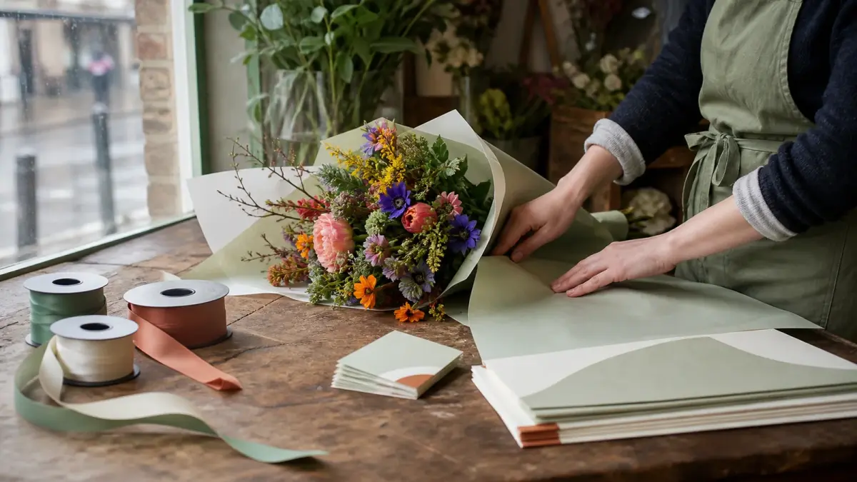
How to choose florist brand colours: four palettes with hex codes, the job each colour does, and the two tests that decide whether yours works.
Pick two or three colours and give each one a job: a dominant that carries your sign and your wrap, a support that fills the space behind it, and an accent used sparingly. Choose them to sit behind flowers rather than compete with them, then test the pair that has to carry your words.
Quarter past six, buckets conditioned, and you are stood in front of the ribbon. The wrap is kraft this week because the sage ran out. The care cards came back cream. The sign has been a slightly different green since the last repaint, and nobody has mentioned it.
Nobody has recognised you either. That is the quiet cost.
Your flowers are the loudest thing you sell and they change every week. Your brand colour is the quietest thing you own, and one of the few things in the shop that can look the same in February as it does in June. Holding it steady is the whole job, and the rest of florist branding is downstream of it.
If you're wondering whether this matters at your size, that is exactly the size it matters at. A chain buys recognition. You repeat yourself into it.
Related: Flower Shop Name Ideas
What colours work best for a florist brand?
Colours do not work in the abstract; roles do. Fill three jobs rather than picking three favourites: a dominant that carries your surfaces, a support that sits behind everything, and an accent that does the pointing.
The dominant carries most surfaces: fascia, van, wrap, apron. The support sits behind text and photographs and works quietly, which is its value. The accent is rationed to what you want noticed.
Four palettes of florist brand colours to start from and adapt, not a shortlist to pick from. The last column is our rule of thumb rather than a rating, and how it lands depends on your street.
| Palette | Dominant | Support | Accent | The catch |
|---|---|---|---|---|
| Stem and chalk | Sage #7C8B6F | Chalk #F4F1EA | Clay #C97F63 | Forgiving. Your neighbours use it too |
| Ink and blush | Ink navy #1F2A37 | Blush #EBD3D0 | Brass #B08A4B | Wedding-smart. Punishes weak photos |
| Paper and coral | Coral #E2603F | Bone #FBF7F0 | Teal #1F5F5B | Street-visible. Too loud for sympathy |
| Forest and cream | Forest #22402F | Cream #F2E9DA | Gold #C9A227 | Quietly formal. Goes dowdy easily |
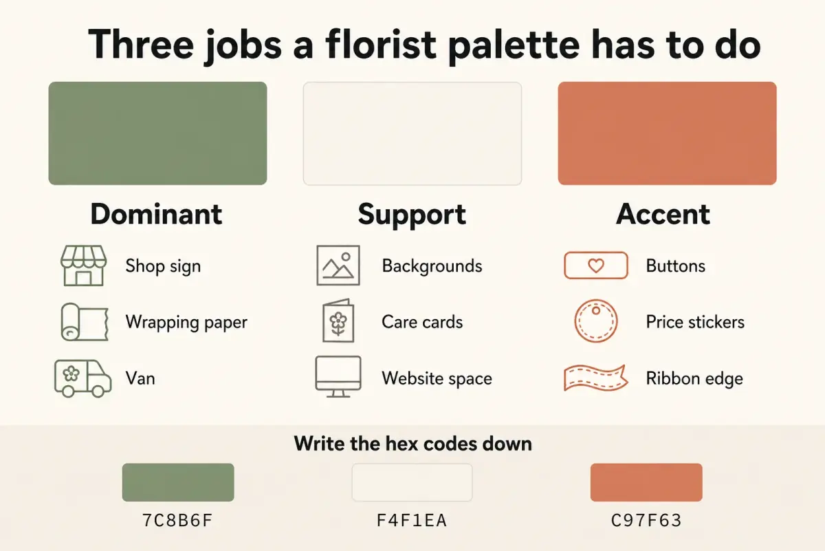
Three roles, not three favourites. The codes at the bottom are the part worth writing down.
Say you take stem and chalk: sage on the fascia and the wrap, chalk behind every word you print, clay on the price stickers and nowhere else.
Whichever you take, save the codes where you can find them at eight in the morning. A palette you cannot reproduce is just a colour you liked once.
What are the most popular brand colours, and should you copy them?
Popular is easy to observe and a poor thing to aim at. Scroll florist accounts for twenty minutes and you will probably see the same soft green and off white coming back, which tells you the palette is easy to like, not that anyone remembers whose it is.
Recognition is a local contest, and a palette you share with the shop two streets away leaves your customer guessing which of you they just saw. What makes florist brand colours work is being distinguishable from the florists your customer walks past.
So run the audit that matters: the shopfronts, vans and feeds of every florist within delivery distance, then choose from what is left. Being the only ink-and-brass shop in a town of sage beats owning the prettiest sage.
Four of the six florists near you are on soft green? Then the palette that helps you is the one none of them own, even if you like theirs better.
What is the 3-5-8 rule for florists?
A proportion habit from floral design teaching, not a branding rule. It circulates as advice to work in odd numbers and stagger the main heights of an arrangement roughly three to five to eight, so nothing sits level with everything else.
It gets pulled into branding articles because it sounds like a formula. We have found nothing showing the ratio itself does anything to the eye, and nothing at all connecting it to a brand. The useful part is the habit underneath: fix proportions in advance rather than in the moment.
Our rule of thumb, and one to adjust rather than obey: one colour on most surfaces, one supporting it almost invisibly, one used on so few things that it still surprises you. Put the accent on a third surface and it has stopped being an accent.
Picture a studio on ink and blush. Ink on the fascia, the apron and the boxes. Blush behind text on the website and the care cards. Brass twice only: the foil on the gift tag and the button that says order.
Then Mother's Day arrives and the temptation is a pink banner, pink stickers, a pink van decal. Mother's Day is the week a palette either holds or quietly dissolves.
Two tests your palette has to pass in public
Taste chooses the palette. These two decide whether it survives contact with customers, and both can be settled this afternoon.
Can people actually read it?
Borrow a benchmark. The GOV.UK Design System states that you must make sure the contrast ratio of text and interactive elements in your service meets Web Content Accessibility Guidelines (WCAG 2.2) success criterion 1.4.3 Contrast (minimum) level AA.
That requirement is aimed at government services and does not bind your shop. Borrow it anyway, because it is published and testable: put your text colour and background colour into any contrast checker and see whether the pair clears level AA. You are handing over two hex codes, so no personal or commercial detail leaves your hands. If a checker wants a file or a sign-in, read its data-use note first.
Where it bites is the small stuff you read close up:
- Blush text on cream care cards
- Sage buttons with white labels in your online shop
- A pale price list at the back of a dim shop on a wet Tuesday
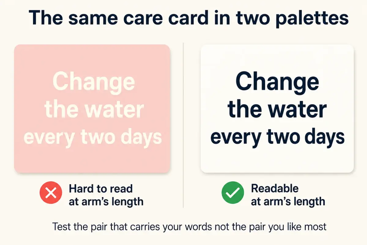
Same card, same words. Only the pair carrying the text changed.
Related: Florist Website Design
Is your green saying something you would have to prove?
Sage, kraft and hand-drawn foliage borrow the visual vocabulary of natural and ethical, which is not the neutral choice it looks like. The Competition and Markets Authority's Green Claims Code guidance states that environmental claims can be explicit or implicit and that all aspects of a claim may be relevant, such as the colours, pictures and logos used and the overall presentation. ASA and CAP guidance states that the Advertising Code requires the basis of environmental claims to be clear, and that unqualified claims could mislead if they omit material information under Rule 11.1.
Read that precisely, because it is narrower than the panic version. Neither says a green logo is a claim on its own. They say your colours are part of how a claim gets judged, and that the basis of any claim you make has to be clear.
So if your palette is doing the eco talking, keep the copy beside it specific. "British grown stems from May to September" is a sentence you can stand behind. "Sustainable flowers" over a field of sage is one you may be asked to explain.
Why this matters: the palette is not the risk. The unexamined sentence sitting next to it is.
Where your florist brand colours have to show up
A palette in your head is a preference. A palette on one page is a brand, because other people can use it.
Write the three codes with their roles, your two fonts and the print and vinyl matches your suppliers give you, somewhere you can send in a message. Screens emit light and paper absorbs it, so ask for a proof before a long run: the sage that glows on a phone can come back from the press like pond water.
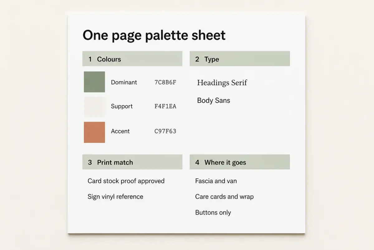
The whole brand, on one page a printer can work from.
Then check where the palette leaks:
- Care cards, ribbon and the tape on your boxes
- Invoices, quotes and florist business cards
- Buttons and headers in your online shop
- Every photograph you post, since your photography style is part of the palette whether you planned it or not, which makes florist photography tips and your colours one decision
Related: Social Media for Florists
If staying on-palette every week is the bit that slips, that is a templating problem, not a taste problem. LocalBrandHub gives you social post templates to tweak instead of a blank square.
Thirty minutes is a starting point, not a target: write your three hex codes and their roles in a note, then apply them to your next three posts and your profile picture. Take longer if the print matches need chasing.
Frequently Asked Questions
Can I trade mark my florist brand colour?
Possibly, though it is specialist work. GOV.UK guidance on what you can register states that your trade mark can include words, sounds, logos, colours, or a combination of any of these. It also states that a trade mark cannot be too common and non-distinctive. That distinctiveness bar is the hard part for a colour: protect the name and the florist logo first, and consult a trade mark attorney before you pay for an application.
How many colours should a florist brand use?
Two or three, with a job each. Two carries a small shop. Three adds an accent for buttons, stickers and the one thing you want clicked. Beyond three you choose every time instead of deciding once, which is how one shop looks like five.
Should my brand colours match the flowers I sell?
No, and chasing the stock is the common mistake. Flowers change weekly and a palette cannot keep up. Choose colours that sit behind them: off whites, deep greens, inks and muted earths, so whatever is in the bucket looks good.
Do I need different colours for weddings and funerals?
The palette stays put. Tone comes from paper stock, photography and words. Keep the dominant and support everywhere, and hold the accent back on sympathy work, where a coral sticker reads badly. A wedding florist portfolio can lean on the support colour and let the flowers talk.
What are popular flower colours?
They tend to follow the calendar rather than your brand: red at Valentine's, white and green for sympathy, pastels through spring, rust and burgundy in autumn, and whatever a bride has pinned. Which is the point of keeping the two apart. Stock colour is seasonal and outside your control. Your florist brand colours are not.
The Short Version
Key Takeaway
Three colours, three jobs, written down with their codes and left alone while the flowers change.
- Roles beat favourites. Dominant, support and accent, written down with codes.
- Recognition is a local contest. Audit the florists near you first.
- The 3-5-8 rule is a floral design convention, not a marketing one: it says nothing about how a customer remembers you.
- Test the pair that carries your words against a published contrast benchmark.
- Green shapes how your claims are read. Keep the copy beside it specific.
Weekly Action
You could do the first two before the shop opens on Monday.
- Choose your dominant, support and accent, and save the hex codes
- Run your text and background colours through a contrast checker
- Photograph your care card, price list and shopfront and compare them
- Note the palettes of every florist within delivery distance
- Check you can back any environmental wording sitting next to your green
For restaurants, salons, and local businesses
Need help with your marketing?
We help UK businesses turn social media into real results, not busywork.
Start freeSources
Get More Marketing Tips
Practical marketing tips for UK business owners, straight to your inbox. No spam, unsubscribe anytime.
About the Author
Local Brand Hub
Empowering UK Businesses
Local Brand Hub provides comprehensive business management tools designed specifically for UK local businesses to streamline operations, automate marketing, and grow revenue.
More articlesRelated Articles
 Marketing Tips
Florist Logo Design: Style Ideas, Files and Ownership
Florist logo design that survives real life: four styles judged at label size, five files to ask for before you pay, and what registering the mark costs.
 Marketing Tips
Florist Business Cards: What to Put on One That Works
What to put on a florist business card, what UK law actually asks of yours, how to handle the QR code, and a card spec you can copy straight to a printer.
 Business Growth
Flower Shop Name Ideas You Can Actually Own
Flower shop name ideas across six styles, plus the UK checks that decide which one you can keep: Companies House rules, trade marks, domains and handles.